Search This Blog

Monday, 28 September 2015

Modeling Methods versus Project File Size

In-place models do have it's place in Revit. However, the overuse of in-place models will have a detrimental effect on your overall project file size, as well as the performance of your hardware.

Often times users create in-place models due to time constraints or to better visualize the object in the project context. There is nothing wrong with that. However, where the problem starts to rear its head, is when one forgets to convert the in-place model to a family after the design has been finalized. 

I often tell my students: Rather try and do things properly from the start, than trying to reverse engineer a model when you desperately need to get your CD's out. 

To demonstrate this, I have created two scenarios where the contribution to file size is compared between an in-place model and a family.

The first comparison uses a 2.5m x 2.5m x 2.5m Cube.

Now, in the example above, there does not seem to be a big difference between a Revit family and an in-place model. Remember though: a cube is not a complex piece of geometry. There isn't that much data for Revit to process.

The second comparison will use one of each available forms in Revit: Extrusion, Blend, Revolve, Sweep and Swept Blend.

The more complex geometry data Revit needs to process, the higher the project file size will become. In the last scenario, there is a 54.3 MB difference between the Revit family and in-place model.

So... Which method would you rather use?

Monday, 21 September 2015

Flexible Ducting Graphics

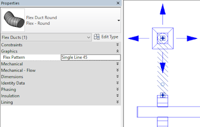
By default, we have eight graphical ways to show flexible ducting in Revit. We can either decide to use one graphic for all flexible ducting, or decide to use a specific graphic to distinguish between for example, Standard Flexible Ducting, Insulated Flexible Ducting, etc.

The images below will show what the graphics look like per flex duct instance property.

1. Flex Pattern: Single Line

2. Flex Pattern: Circle

3. Flex Pattern: Oval

4. Flex Pattern: Flex

5. Flex Pattern: Flex 2

6. Flex Pattern: Curve

 7. Flex Pattern: Single Line 45

 8. Flex Pattern: Undefined

Friday, 18 September 2015

Where's My Options Bar?

My options bar is missing!

Have a look at the bottom of your screen. The options bar can either be docked to the top (Underneath your Ribbon), or to the bottom (Above your Status bar) of your screen. This is done by right clicking on the options bar itself, and selecting Dock at top or Dock at bottom.

Monday, 14 September 2015

To Photometric, or not to Photometric

Revit's default light sources work. Most of the time though, these default or standard light source definitions will not create an acceptable diffusion of light within a room. We will investigate what results can be achieved between a default light source, and a photometric light source in Revit.

1.1 Standard Light Source definition

1.1 Rendered Result

2.1 Photometric Light Source definition

2.2 Rendered Result

There are pro's and con's with both light sources: 

  • Standard Light Sources:
    • Pro: Lighter in size in terms of the data it contains
    • Pro: Renders are completed faster due to the above
    • Con: Renders might not be an accurate representation of the actual light diffusion
  • Photometric Light Sources: 
    • Pro: Actual diffusion is more accurate due to the IES file attached to the light source
    • Con: Rendering time will suffer, as there are a lot more data to process

Wednesday, 9 September 2015

Cape Dutch Architecture

"Cape Dutch architecture is a traditional Afrikaner architectural style found mostly in the Western Cape of South Africa. The style was prominent in the early days (17th century) of the Cape Colony, and the name derives from the fact that the initial settlers of the Cape were primarily Dutch. The style has roots in mediaeval Netherlands, Germany, France and Indonesia.
Houses in this style have a distinctive and recognisable design, with a prominent feature being the grand, ornately rounded gables, reminiscent of features in townhouses of Amsterdam built in the Dutch style. The houses are also usually H-shaped, with the front section of the house usually being flanked by two wings running perpendicular to it. Furthermore, walls are whitewashed, and the roofs are thatched.
Most Cape Dutch buildings in Cape Town have been lost to new developments – particularly to high-rises in the City Bowl during the 1960s. However, the Cape Dutch tradition can still be seen in many of the farmhouses of the Wine Route, and historical towns such as Stellenbosch, Swellendam, Tulbagh and Graaff-Reinet.
One characteristic feature of South African colonial architecture which has attracted the attention of many observers is the extensive use of gables. Earlier research has repeatedly sought to justify the term `Cape-Dutch' solely by comparing the decorative form of these gables to those of Amsterdam. However, in the second half of the 18th century, the period in which, the entire development of the South African gable tradition occurs, gable architecture had gradually ceased to be built in Amsterdam. North of Amsterdam, along the river Zaan, however, gable design remained vigorous until the capture of the Cape. South African gables have many features in common with gables along the river Zaan, in spite of the different materials used." Source
Note: All renderings have been done using Enscape


Wednesday, 2 September 2015

Duct & Pipe Segment Pressure Loss Report

When generating a pressure loss report for a duct system, the results provide quite a lot of information for certain duct sections. However, how do we graphically see which sections have what values? This blog entry will discuss these pressure loss report settings for a very simple Supply Air System, as per the image below.

When the Pressure Loss Report command is started, we can choose which fields should appear in our report.

We can also choose which fields are displayed for our duct pressure losses per section, as well as those for our duct fittings and accessories.


When we generate our duct pressure loss report, we will see our duct section numbers, as well as the critical path. To determine which duct section the report extracts information from, we can select our duct and look at our Mechanical Properties.

The above method does work, however: Imagine how long it would take, even on a small scale project, to identify and remember what section number belongs to which duct! There is a workaround: Tags.

We can create a dedicated Duct Pressure Loss Tag family which will graphically show all our required pressure loss calculation results, such as the Section, Pressure Drop, Velocity, as well as Velocity Pressure.

Duct Fittings works a bit differently though. We do not have all of the parameters available as we do have for ducts. We need a workaround: We can simply add the Mark parameter to our Duct Fitting Pressure Loss Tag.

These tags we can add in a plan view, but we will struggle to tag hidden sections, for example a riser and a dropper duct with all of its fittings.

It is often easier to rather create a dedicated 3D view in which we can see what we tag, and what their values are.

I predominantly work on a laptop, so I tile my Revit and Pressure Loss Report windows to easily see what values are applicable to which duct segment. Working on dual screens will make this task much easier! 

UPDATE (2016.01.07): A question was asked regarding multiple taps on a single duct. The software still recognizes that even though one has a single duct, wherever a tap occurs, a new duct section is created. The Duct Section, Pressure Loss, Velocity Pressure and Velocity values changes accordingly.