What inspires you as an architect, an engineer, a visualization expert, or a CAD operator?
Personally I am inspired by others: People like Kelvin Tam, otherwise known as Captainswat for his famous Revit Ironman. Similarly, Marcello Sgamberulli became infamous through his Simply Complex blog entry: The Elephant in the Room, which evolved into The Revit Cow. Zach Kron from Buildz is another favourite of mine, especially for his Parametric Pumpkin Carving competition (Amongst others). Paul Aubin has been another inspiration of mine for the past few years. His Renaissance Revit: Creating Classical Architecture with Modern Software book is well worth purchasing. Andy Milburn from Grevity for fathering Project Soane. And lastly, Jeffrey Pinheiro from The Revit Kid with his books: BIM After Dark, is another great inspiration for me.
I guess that, in a nutshell, I am inspired by people who make the technology they have work FOR them. Kudos to you all and to all the other great authors out there.
This Revit Recess entry will show the steps taken to create a Human Skull in Revit - And as a teaser, look how awesome the rendered result was!
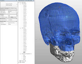
I found a 3D skull family I downloaded months ago from a free CAD website somewhere in my "TBO" folders ("That's To Be Organised" for the non-procrastinators out there). The assembly contained the skull with upper jaw, lower jaw, upper teeth, and lower teeth. These parts were brought into a Mass family, re-scaled and re-positioned to create the Mass family.
Using dedicated levels and sections with named reference planes, I managed to control where I wanted to add reference points (Basically on all triangulation intersections within the views). After these points have been placed, the point element's X-axis position was specified by manipulating the 3D view and moving the XYZ-widget into place.
Planning, planning and more planning. The time came to plan how I was going "connect the dots", if you will, by placing reference lines.
The end result looked like this.
The two halves were then nested into a Master Skull Mass family, and mirrored across.
Aaaand.... here is where I lost track of time. I thought to myself that this skull would look awesome if it was made from gold.
And then I thought, "while your at it... Why not create a quick render?"
Which evolved into a night render with a studiolight placed inside of the skull itself.
And just for fun (Read OCD), how would a toposurface created from this skull look like? I quite like the result.
Hope you enjoyed reading this one, I certainly did creating it!


No comments:
Post a Comment